
Dossier #006 // Course & Design System
A customized foreign language course for business professionals — delivered through a marketing site and courseware built on one design system: the Magister Approach.
Placeholder Client
Editorial Design, Systems
Design System, Templates
20XX
[Placeholder] Describe what was broken before the project: the scattered materials, the missing voice, the friction the client felt.
[Placeholder] Describe what you delivered: the system, the story, the transformation from input to output.
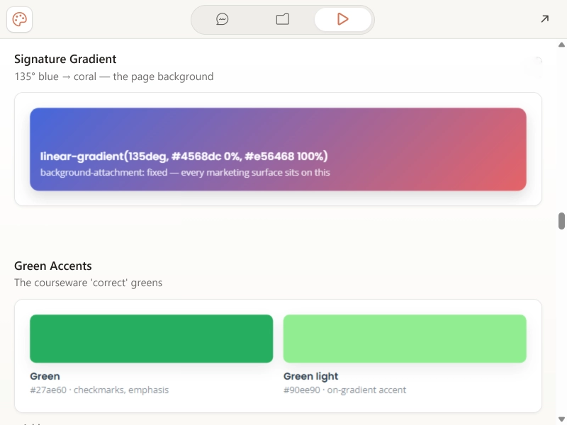
Before a single component existed, the system settled its two founding decisions. A signature gradient — 135 degrees, blue to coral, fixed to the page — became the ground every marketing surface sits on. And green was reserved as a semantic color: in the courseware it means "correct," and nothing else. Color with meaning, decided first.
↓ Two decisions first: one gradient to live on, and green means "correct" — nothing else
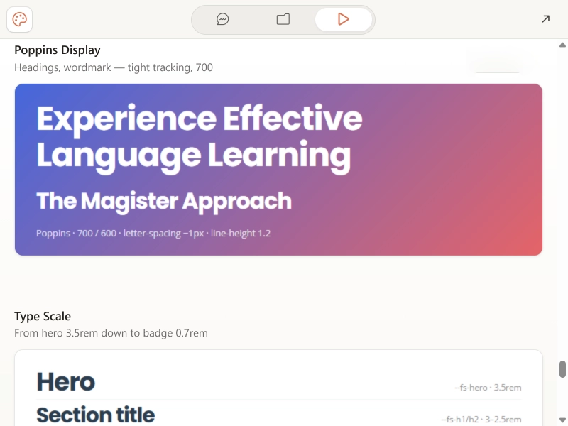
Refinement happened in the details most visitors never notice but always feel. A Poppins display ramp with tight tracking, scaled from a 3.5rem hero down to a 0.7rem badge. Cards that lift 5 pixels on hover, buttons that warm from white toward coral, every transition on the same 0.3s ease, and a five-step shadow system ending in a brand glow. The invisible stuff, decided on purpose.
↓ Tuning the feel: type ramp, lift, ease, glow — with the numbers to prove it
What shipped: a live marketing site whose components are built entirely from the core primitives. Course cards and feature cards where the badge, the checkmark greens, the stat rows, and the imagery all sit on the signature gradient — nothing invented per-page, everything drawn from the system. It's all documented in a living style guide the client keeps, so the next page starts from the same source as the first.
↓ Built from the primitives — the gradient, the green, the ramp, all in one card