Dossier #002 // Integrated Brand Identity
Lower6 Next™ is a cutting-edge Vision AI-powered platform designed to effortlessly analyze your food images. Redefining market presence through a cohesive visual language and narrative strategy.
Lower6
Brand Strategy, Visual Identity
Identity System, App UI, Guidelines
A cutting-edge Vision AI platform with powerful technology but no cohesive brand identity. Fragmented visual language, unclear market positioning, and a disconnect between the innovative product and its presentation.
A comprehensive brand system that positions Lower6 as the premium choice in food tech. Clean, modern visual identity paired with strategic messaging that bridges technical innovation with everyday wellness.
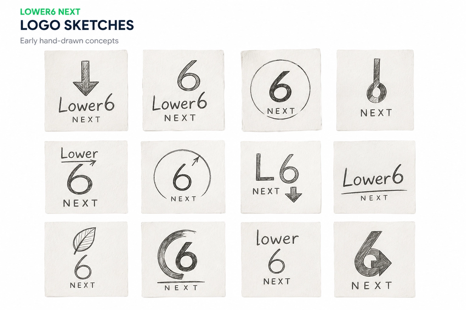
Lower6 Next™ required a complete brand overhaul that would resonate with health-conscious consumers while showcasing AI sophistication. We started with a brand audit, competitive landscape analysis, and user persona development — then took it to paper, sketching logo concepts around the "6" before touching a screen.
↓ Early hand-drawn concepts — twelve ways to say "lower"
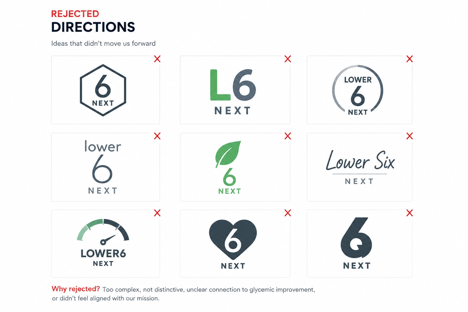
The visual identity system came together through color theory, typography, and iconography design — a visual ecosystem that feels both approachable and cutting-edge. Just as important were the kills: directions rejected for being too complex, too generic, or disconnected from the mission of glycemic improvement.
↓ Rejected directions — ideas that didn't move us forward
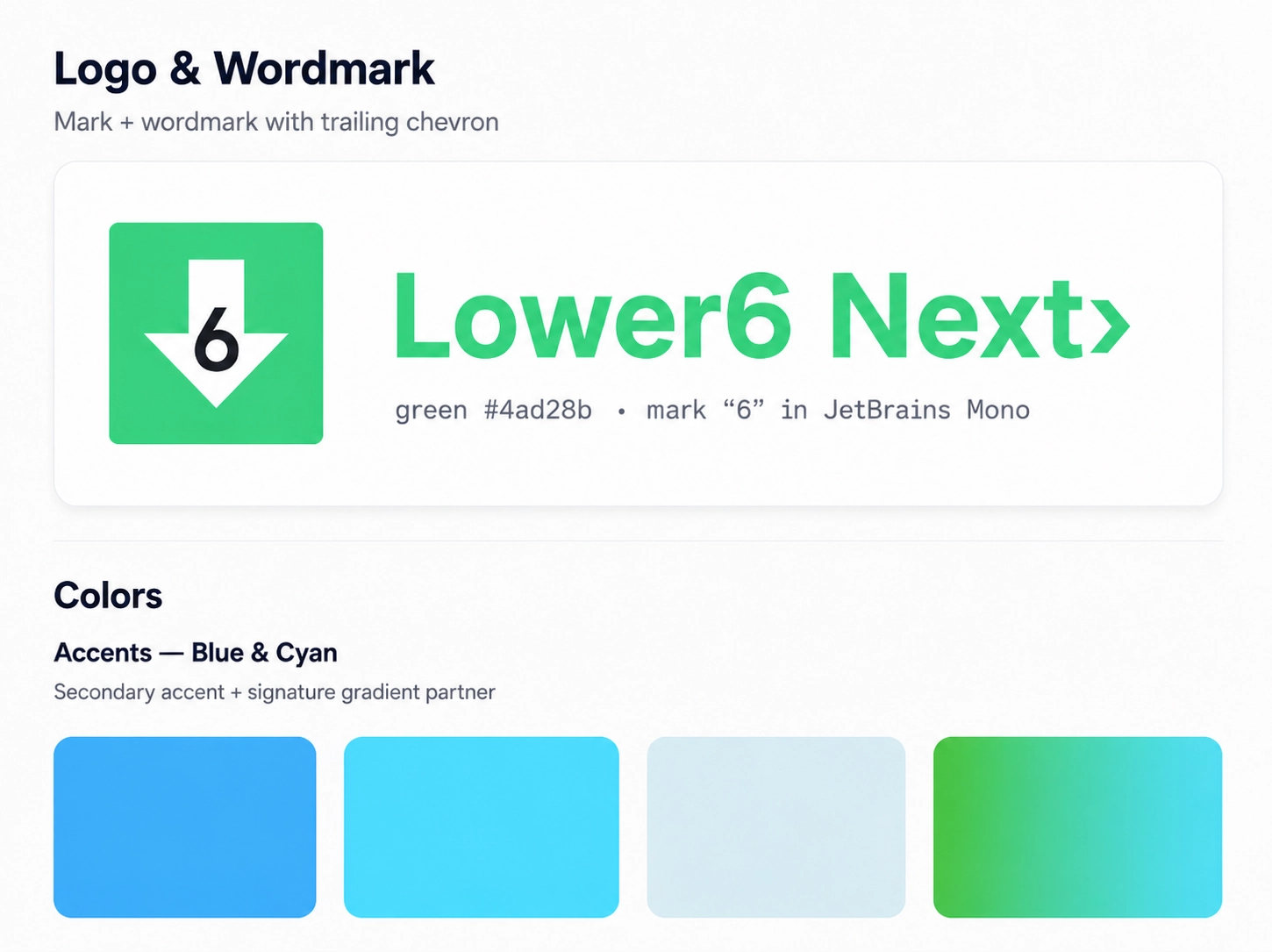
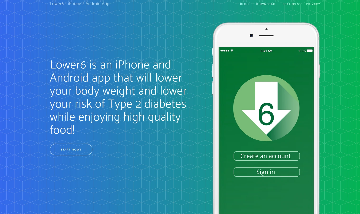
The identity shipped two ways: a landing page that leads with the brand, and a living style guide documenting the system behind it — logo and wordmark, color ramps, type, and components. The guide is a client deliverable, not an internal file: Lower6 keeps the system, so every future page, post, and screen pulls from the same source instead of reinventing it.
↓ From the style guide: the mark, the wordmark, and the accent system